5 Brand Elements Your Website Needs Now [with Phillip Blume]
Want more information on this article? Watch the related video below. Or to view the published version of this article and others written by top photographers, subscribe to the November 2017 issue of Shutter Magazine, the industry’s leading professional photography magazine available online and at Barnes & Noble booksellers everywhere.
Can a website update really double your bookings? Eileen and I (The Blumes) are about to find out.
In case you don’t know this chapter of our story already, in 2009, my wife, Eileen, sat down after her Starbucks shift one day and hand-coded our first photography website which not only made transformative results on the web, but also increased our brand value and customers. She had never coded before, and the result wasn’t pretty by today’s standards. But it served its purpose: a simple gallery where we could share our hobby photography with family and friends.
What happened next was a shock.
We began to receive phone calls. Phone calls from complete strangers inquiring about our photography services. We got online at a time when some businesses—even photographers—were still using the yellow pages. And we realized that people might actually pay us to do what we loved. Thus, Blume Photography was born out of a happy accident (our ugly website), and we left our day jobs to pursue photography full-time within the first year.
The Internet hasn’t worked quite so easily for us over the last few years. But should it? Isn’t today’s Internet a battlefield? Every photographer is online competing to be seen. Do you feel as lost as I have inside the maze of HTML, SEO jargon and social media strategy? I’m a photographer, and I understand business. But I’m not a tech genius.
The last time we upgraded our site was in 2011, to a popular WordPress theme. Despite its ease of use, our careful lead tracking made it clear that some pretty major roadblocks must be preventing Internet traffic from reaching us. Let’s look at some of those roadblocks—and how to fix them on your website.
By the time you read this issue of Shutter, our brand-new Showit site will have just launched. We’ve invested a lot this year to sit down with many of the most successful web marketers in our industry. And we kept hearing the same tips about effective website design.
Check out the new site’s homepage at www.theblumes.co, and you be the judge of whether it measures up to the goals I’ve laid out below.
1. Be Your Brand
Once upon a time, a professional logo and Web address were enough to brand your business. Not anymore. Potential clients aren’t impressed because you look like a “real” business. Professionalism is expected—but hundreds of other photographers already have that going for them. What makes you different?
Professionalism doesn’t make you stand out. Personality does.
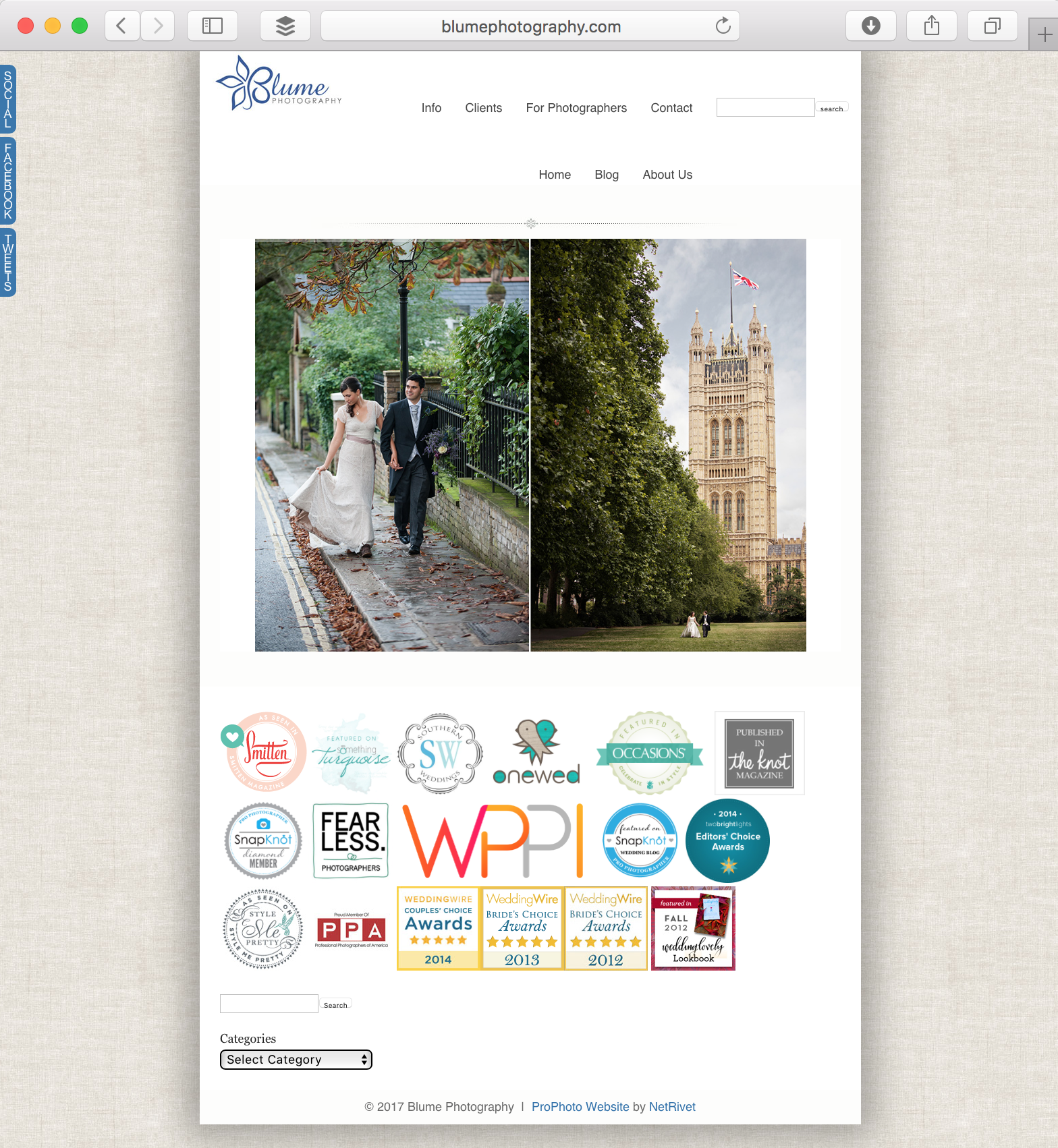
As I write this, our homepage is a mess. It is a typical splash page with a portfolio slideshow directly above a hodgepodge of logos from publications that have published our work (Fig. 1).
“Looks all right to me,” you say? Unfortunately, the problem goes beyond aesthetics. You see, everyone used to describe websites as “storefronts.” A splash page made sense because it showed samples of what you offer, like products behind a department store window. Now, though, options are so numerous that buyers experience a much higher degree of consumer retreat.
You’ve probably experienced consumer retreat. When we find too many options online, we click away. It’s why I still haven’t purchased a sparkling-water maker even though it’s remained the only item on my wishlist for the past five holidays. I can’t decide which one to buy.
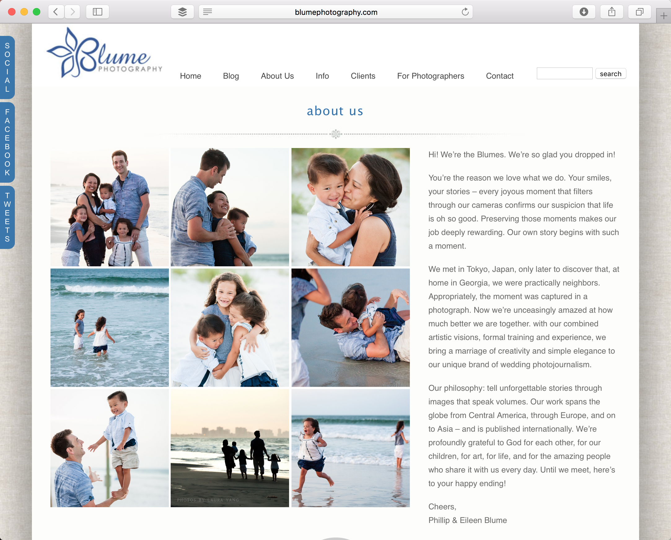
As people retreat from things in our modern world, they gravitate back toward relationships and people. This excites me, and I think it’s incredibly healthy for a post-consumer culture. Introduce yourself the moment a prospective client lands on your page. Show pleasant photos of yourself at work and play. Come up with three words that describe you best, and make them your slogan.
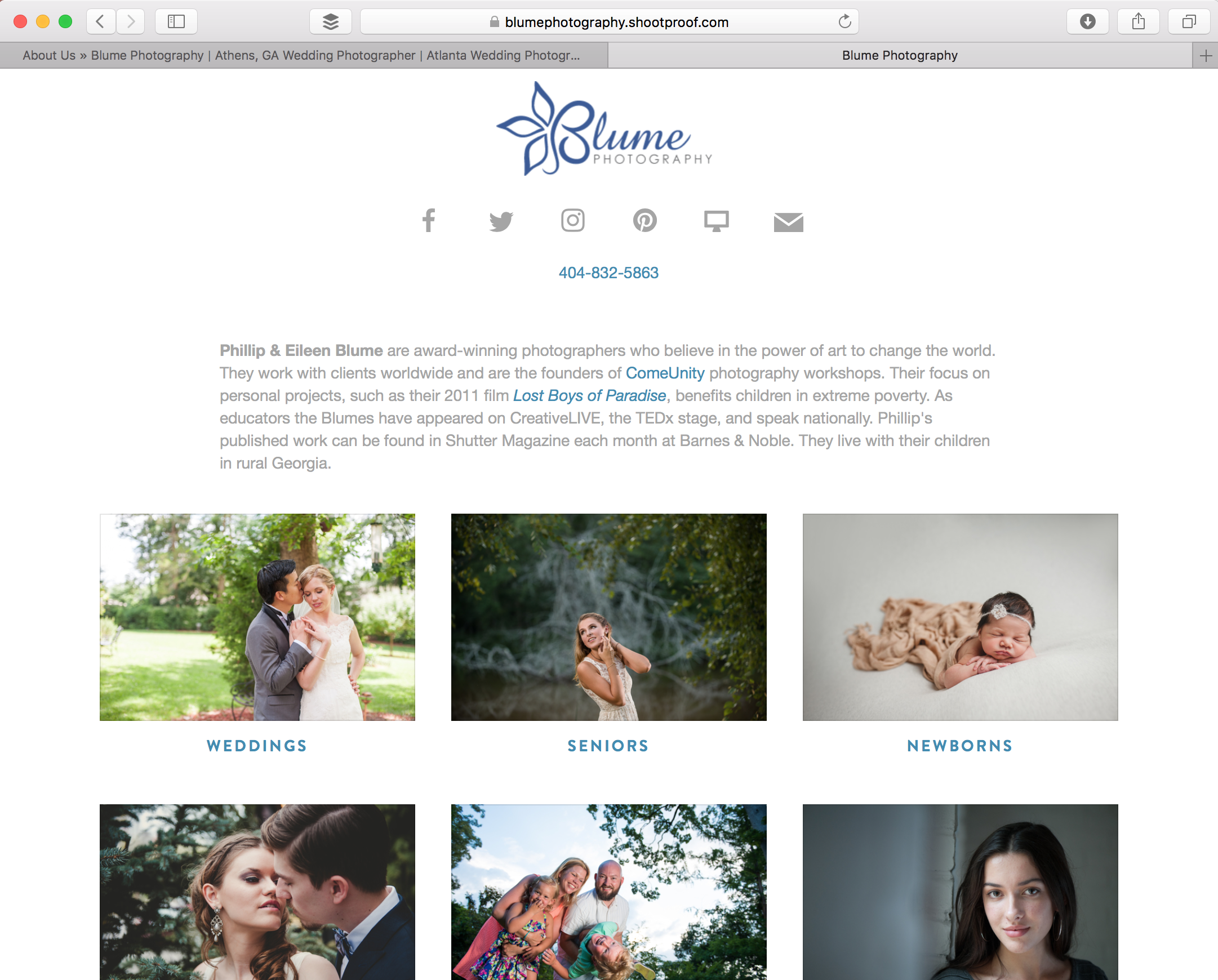
If you visit www.theblumes.co now, you’ll see more of the personal info we’ve been hiding on our About page (Fig. 2) out in the open. Now, instead of offering a product line, we’re offering a handshake. And who’s going to refuse a handshake? When that bond is made, it’s natural to pull someone through the door.
2. Curate Your Work
Of course, it isn’t enough to offer just a handshake. Try to sell me a car without a test drive, and I’ll interpret your handshake as less than forthcoming. Yes, I’ve learned we still need to show our work on the homepage. But less of it.
It comes back to consumer retreat. I imagine a client might be impressed by the quantity of my work. “If she leaves our site without seeing that one amazing image that speaks to her, she’ll never book us,” I convince myself. It’s almost an obsession, as if I want my website to tell my entire life story and reveal every destination location where we’ve had the honor to shoot.
The old adage is true. Less is more. You think you’ve curated your work down enough? Curate it tighter.
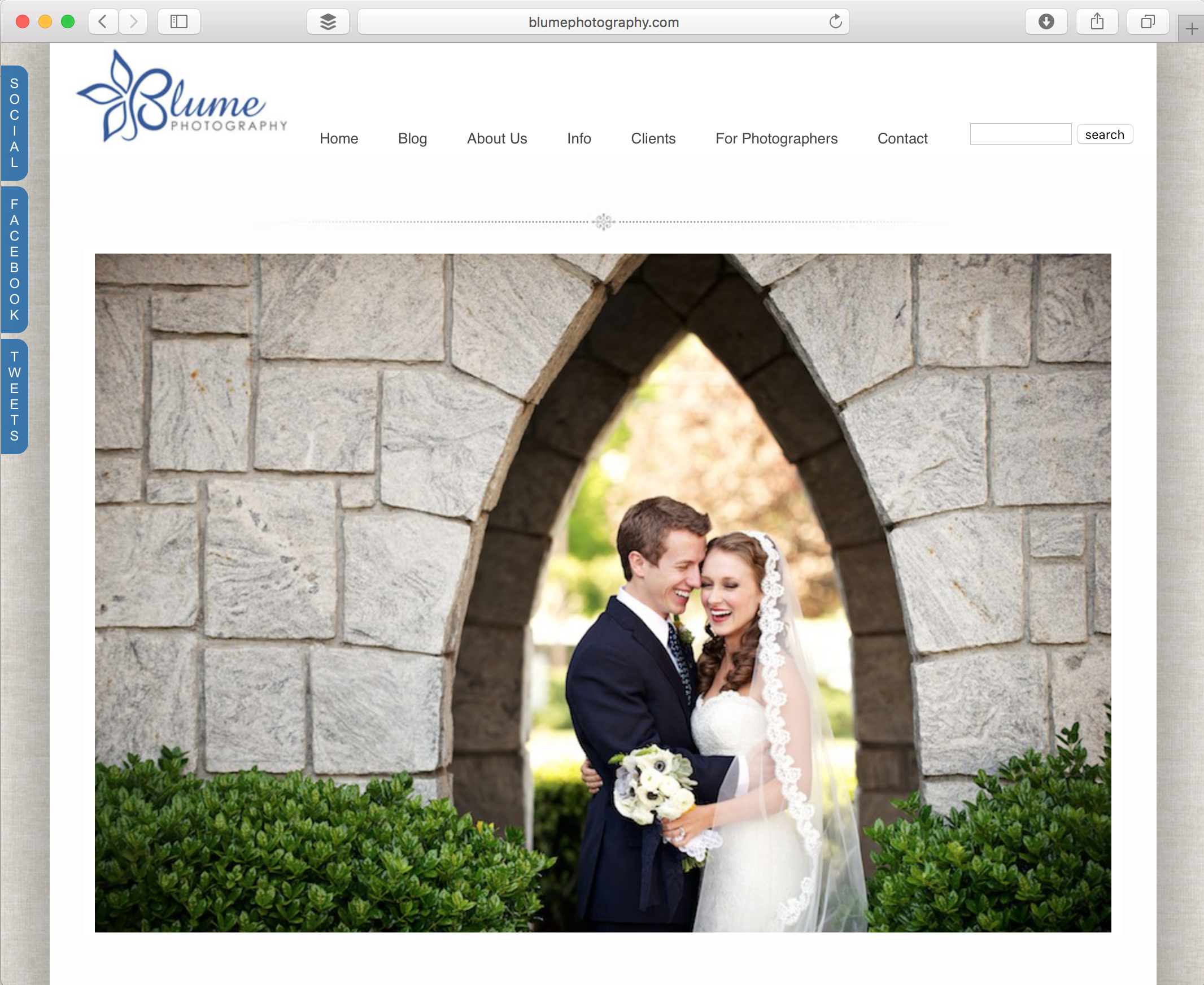
I know, curation is hard. That’s why professionals like my sister in London are paid well to parse down museum exhibits. It takes practice and courage. I’ve been a coward up until now. Our current portfolio slideshow has 30 images (Fig. 3). My email reply to new inquiries provides five links to blog posts with 100 photos each. Talk about overstimulation. If anything, I’m projecting desperation to clients with all those “look at me” antics.
The most successful photographers’ sites I’m studying now reveal only three or four portfolio images on their homepage. Crazy, right? Beyond the homepage, they provide links to just three or four featured weddings or portrait sessions.
It seems counterintuitive. Will visitors think you’re inexperienced because you have only three weddings to show? Take a step of faith and curate. Most visitors assume a greater breadth of work if your samples are fewer and consistent in style. The limited number of images will remain burned into their memories more effectively. And they’ll reach out to you because you focused on introducing yourself with confidence, not on parading your work.
3. Hold Their Hand
Websites can be a maze. That was cool in the early, dark days of a younger Internet, when surfers had time to kill finding Easter eggs and backdoors between the net’s far fewer websites.
Visitors have zero time to kill on your website. They don’t want to play games. They’re looking to make a quick connection, solve a problem and move on. How can you help them?
From now on, I’ll be thinking of my website not as a store, but as an in-person sales encounter. Imagine what that encounter might be like if you owned a physical studio and a cold prospect walked in to request information. Would you ask their name? Offer advice? Provide an informational brochure? Suggest a next step?
Yes, all those things. And in the process, I bet you’d get their business card or contact information so you could follow up. But most of us do none of those things on our website. That’s a missed opportunity.
Branding is all about providing an experience, and often that simply means leading a horse to water. You don’t have to give clients a foot massage. Just help them find what they’re looking for, and the experience they have will feel rewarding.
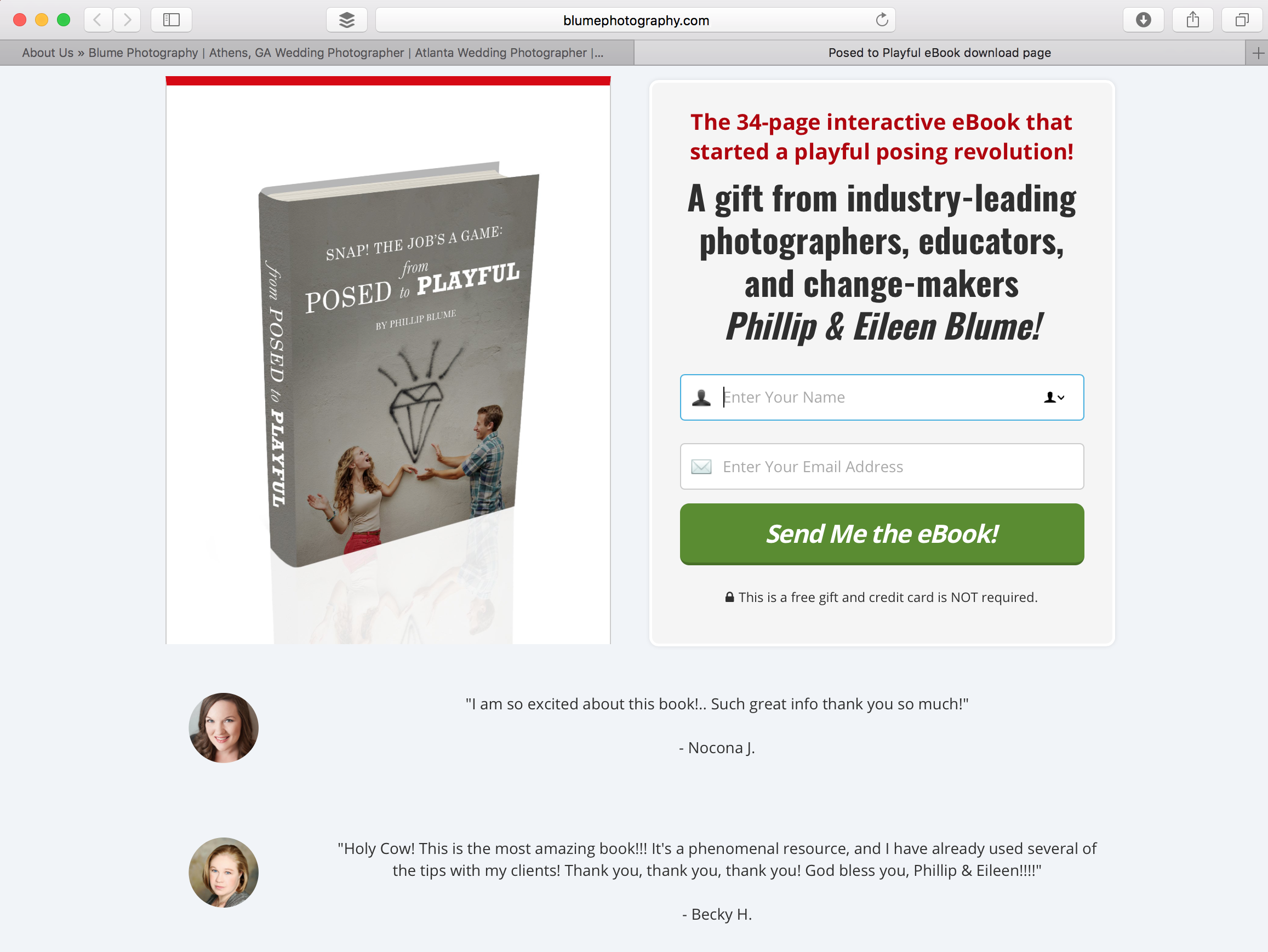
So offer a carrot. There are lots of cheap or free tools that allow you to exchange digital info for an email. Create an eBook with your best wedding planning advice, or a mini-guide to help mothers photograph their children better. By providing value to strangers through your website (Fig. 4), you’ve already made a connection and earned the client’s trust through a positive experience.
What’s more, you’ve gained an email address where you can follow up strategically and convert more leads—even many you never knew were visiting your website before.
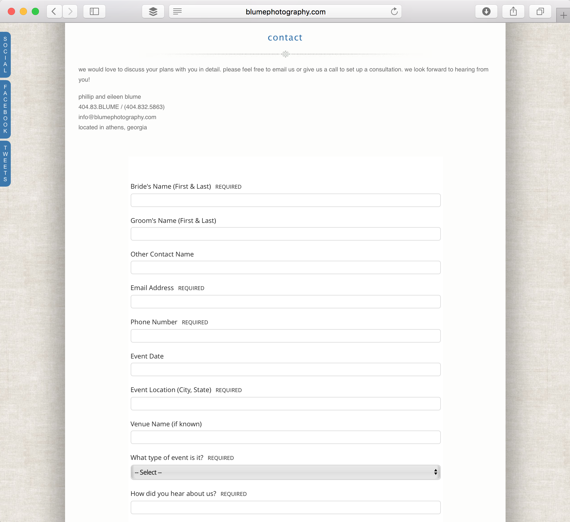
Pro tip: Use a studio management tool like 17Hats to build more personal contact forms (Fig. 5) that reply automatically to help convert leads. Free starter accounts from Mad MiMi or MailChimp are excellent for building email follow-up campaigns.
4. Video Is King
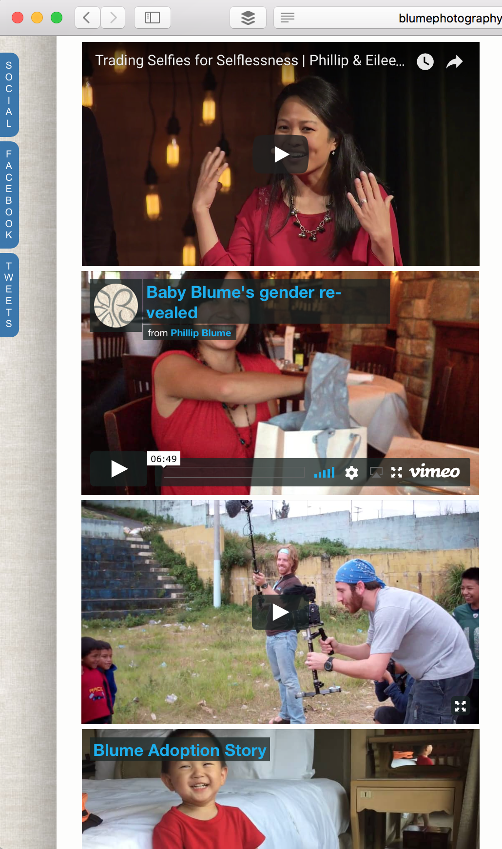
As of this writing, all our personal bio videos live in a hidden corner of our website (Fig. 6). Even so, a huge percentage of our most solid leads mention these videos when they inquire. We always knew video would become important one day, but I didn’t realize how powerful it would become.
You better believe we’ll be working on at least one bio video to feature front and center on our new www.theblumes.co site. If today’s clients are making such strong connections through video, imagine the results if more cold leads landing on your site actually saw those videos.
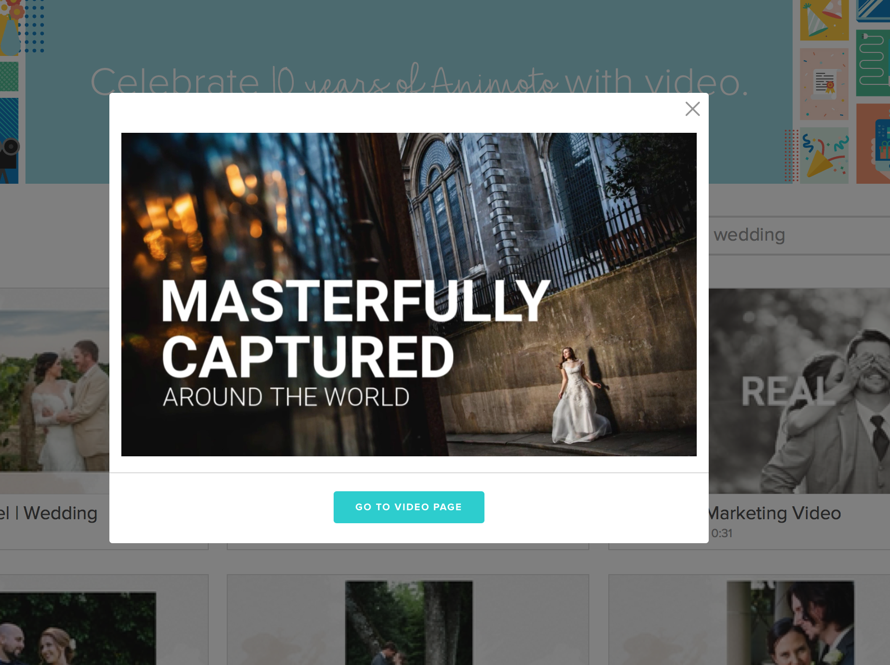
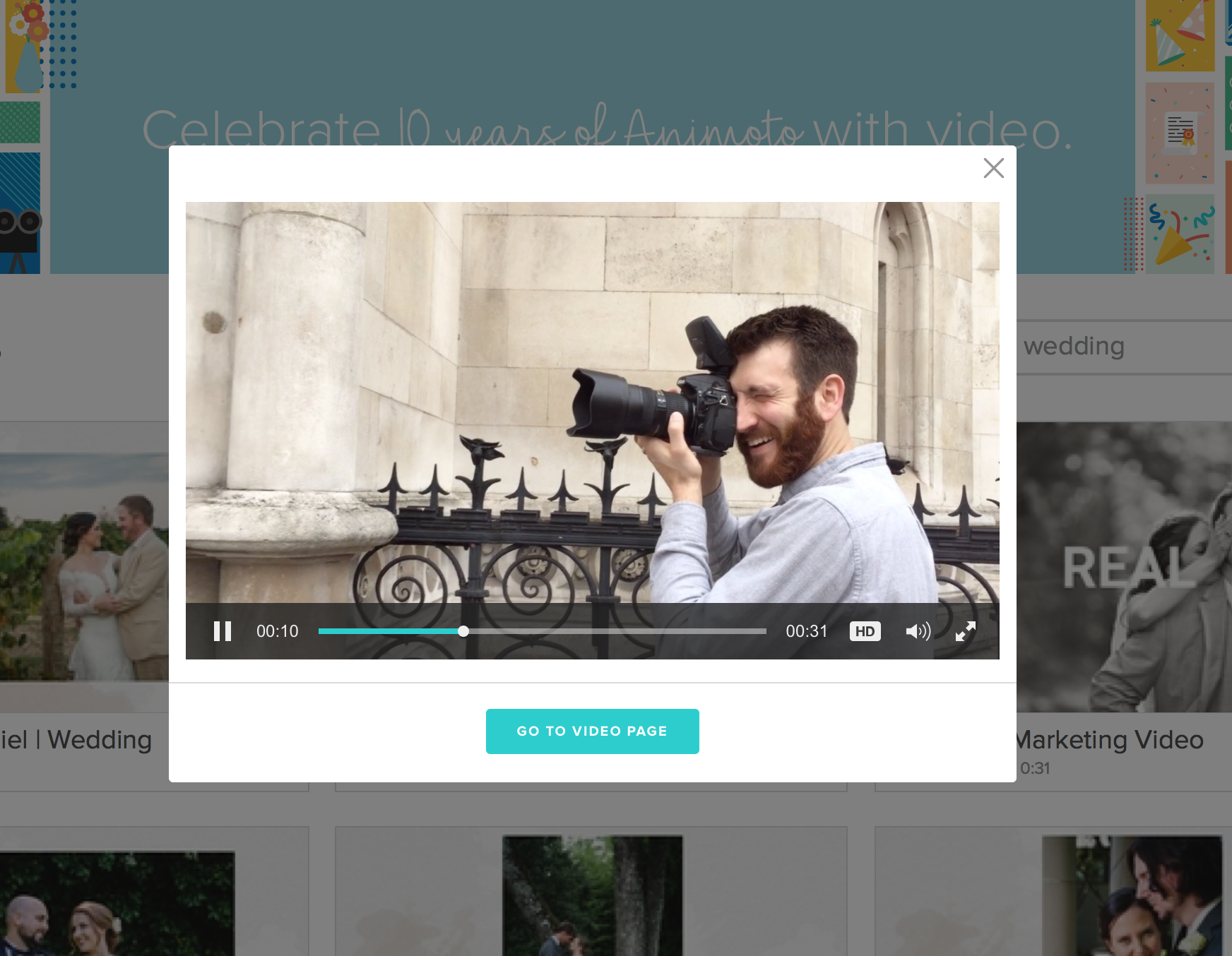
Here’s your homework. If you don’t have a personal bio video, consider paying a talented videographer to create one for you. In the meantime, you can create some amazing videos yourself with almost the same effect in minutes. Just plug your own photos and text into a video template at Animoto.com. Their new Marketing Video templates are amazing (Figs. 7, 8a). They also provide an interactive “call to action” that you can embed on your website in seconds.
5. Create Credibility
Can you guess which human emotion researchers say most accurately predicts sales? Hint: It’s trust.
Consumers have always gravitated toward brands they trust and whose ideals they identify with. To paraphrase author Simon Sinek, people don’t buy what you do, they buy why you do it.
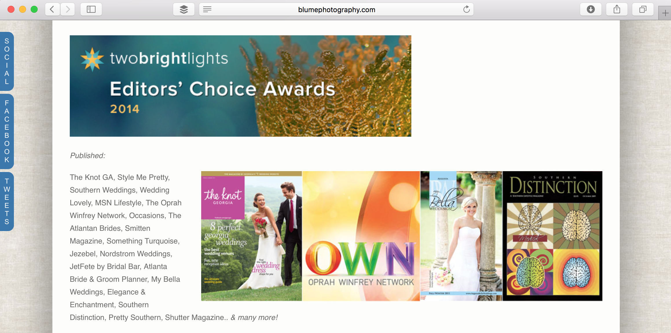
Yes, it always helps to feature a few awards or recognizable magazines where your work has been published. Recognition from fellow professionals lends credibility. Include it wherever you can. Even our ShootProof photo gallery page lets us do it (Fig. 8b). On our next attempt, though, we’ll try harder to display accolades in a more branded, less colorful way than you see here. Let’s just say if a magazine features your work in a swirling psychedelic layout, don’t bother sharing it on your website like we did (Fig. 9).
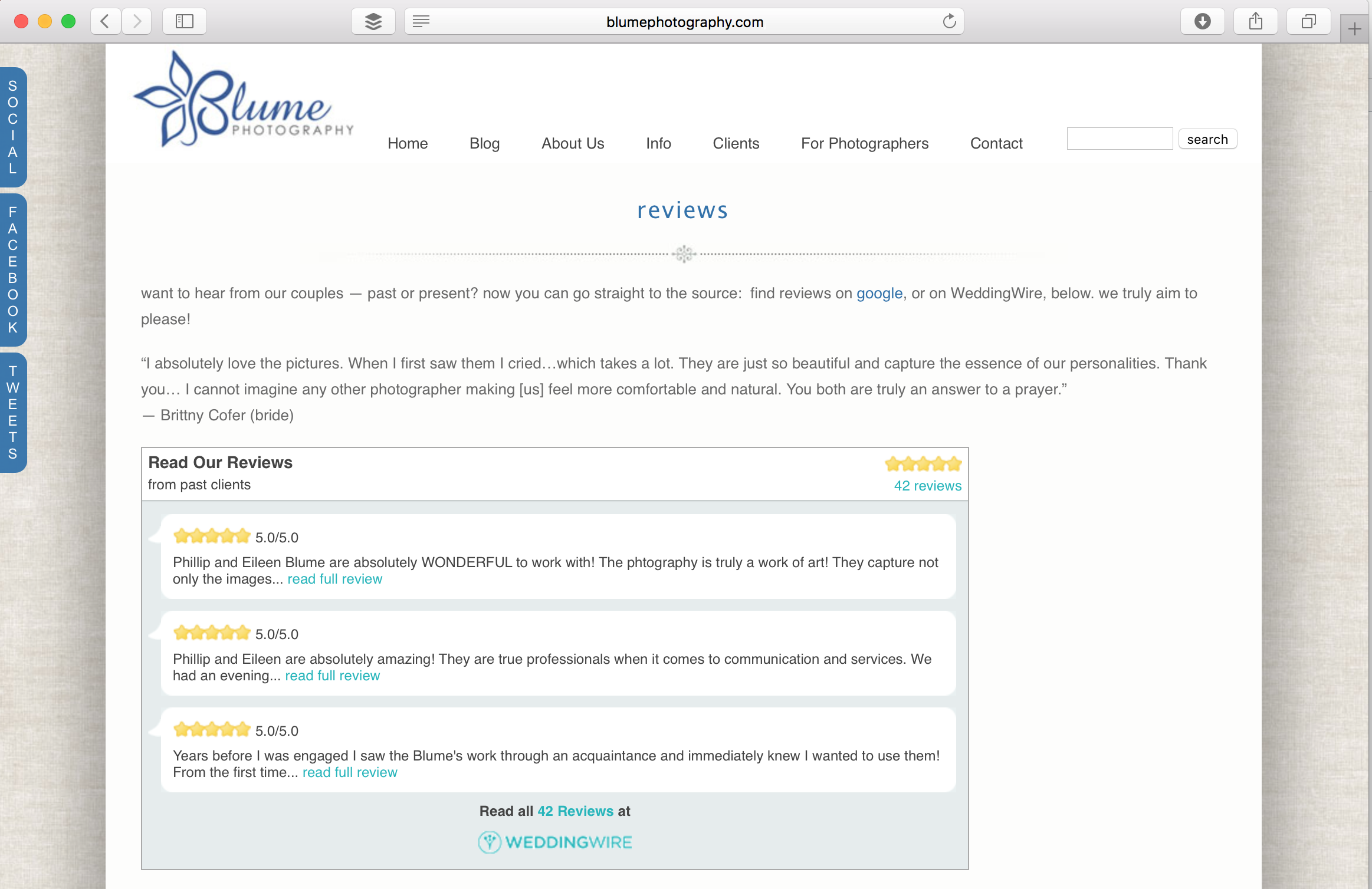
But the most powerful credibility you can provide is social proof. Let future clients hear from past couples and families. Don’t just provide a link to online reviews like we did (Fig. 10). Sure, we had the right idea. But get more serious about reviews. Don’t be shy. Ask your best clients for this favor. Make graphics with their best quotes attached to their best photo. Get creative and collect video reviews. Incorporate them throughout your website, not just on a reviews page.
Conclusion
Website design is now more important to your brand than ever before. Strong word-of-mouth has allowed our business to thrive despite a poor website. I didn’t even mention how poorly our old site performs on mobile, which now accounts for the majority of Internet traffic. Yes, you read that correctly: Up until now, most people on the Internet couldn’t even make our site work, no matter how good it looked.
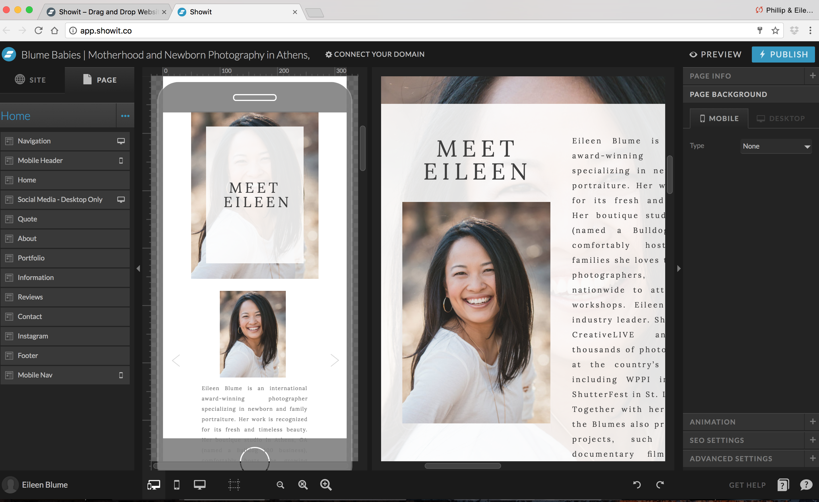
The Showit 5 design technology is amazing. It allows us to design our own site with drag-and-drop interface rather than coding. But more importantly, it’s made for mobile. So Eileen can design a custom look for our site on mobile phones in a window adjacent to our new desktop design (Fig. 11).
We have friends whose bookings more than doubled the week after they updated their site to Showit. You can use a similar tool, but Showit is the only platform designed just for photographers—and you can redesign your WordPress blog with it, too. Whatever the outcome, our new site is sure to look a lot better than our first one.
Let us know what you think. Click over to www.theblumes.co, where we’re giving away lots of awesome photo prizes to celebrate the new site launch this month.
Want to hear more about strategic Website design for photographers? Listen to our interview on the Bokeh Podcast to go even deeper.

[…] about the 5 strategies we followed to create a more impactful website? The Showit5 drag-and-drop website builder made it […]
Love these tips! Thank you for sharing them.
You’re so welcome, Jennie! 🙂
[…] more ideas to market through your photography Website design, read our full article “Five Brand Elements Your Website Needs Now.” (Includes […]