We’re pleased to provide the following image samples and descriptions as a supplement to our article, “Invisible Light,” in the current issue of Shutter Magazine (Aug. 2015 issue). If you landed here for the first time after reading the article or watching its embedded instructional video, welcome to the Blume Blog! Feel free to browse more educational material especially for you, the photographer. If you like what you read, we hope you’ll download our free eBook while you’re at it!
If you aren’t familiar with Shutter Magazine, this is your lucky day! We’re proud to be ongoing contributors to this monthly publication, one of the world’s most popular for photography education. We invite you to join more than 100,000 other photographers who already subscribe to the print and free digital versions of SM. Or pick up the latest issue at any Barnes & Noble booksellers nationwide.
Read the full article’s text FREE online here. For full article/images/
Enjoy!
Phillip & Eileen Blume

Fig. 1 (Above and Below) – An ambient exposure is taken in-camera, preserving natural highlights. Flash added from camera right (shoot-through umbrella).

Fig. 2 (Below) – Original image lacks clear visual focus. Slightly underexposing the ambient light softens the bright yellow pallet. Light from two flashes camera left. (Although bare bulb, multiple flashes help fill each other’s shadows and appear softer.)
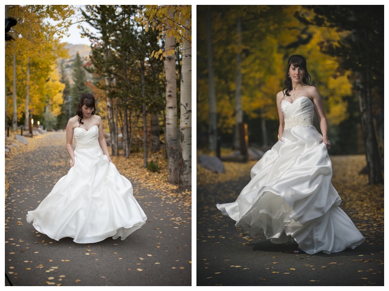
Fig. 3 (Below) – Choose a low manual setting for your backlight. Test to confirm it is subtle and doesn’t blow out fine details (e.g. the smoke). Finally, add a main light – in this example, on-camera flash in TTL bounced against a wall in front of the subject.
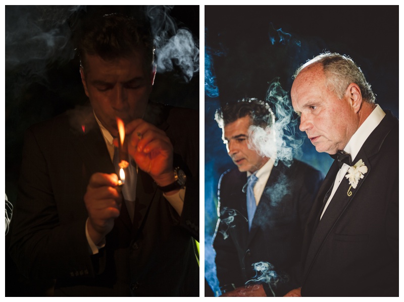
Fig. 4 (Below) – Unlike portraits, details often look best when directly side-lit. In an open area, place a subtle backlight far to the back of the space to provide separation, as well as similarly colored light throughout.
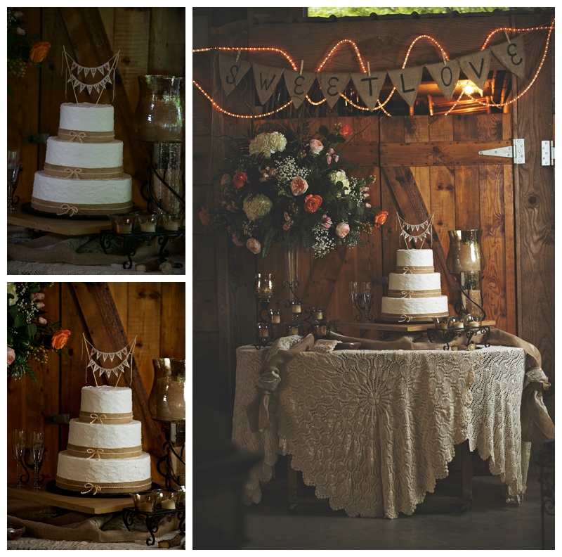
Fig. 5 (Below) – Off-camera flash is more powerful (and more apparent) the closer you place it to your subject. Here the flash was set at a distance from the subject (about 15 feet), and so creates a similar exposure on the bent tree and rocks in the foreground, just as a distant natural light source would.
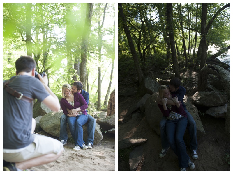
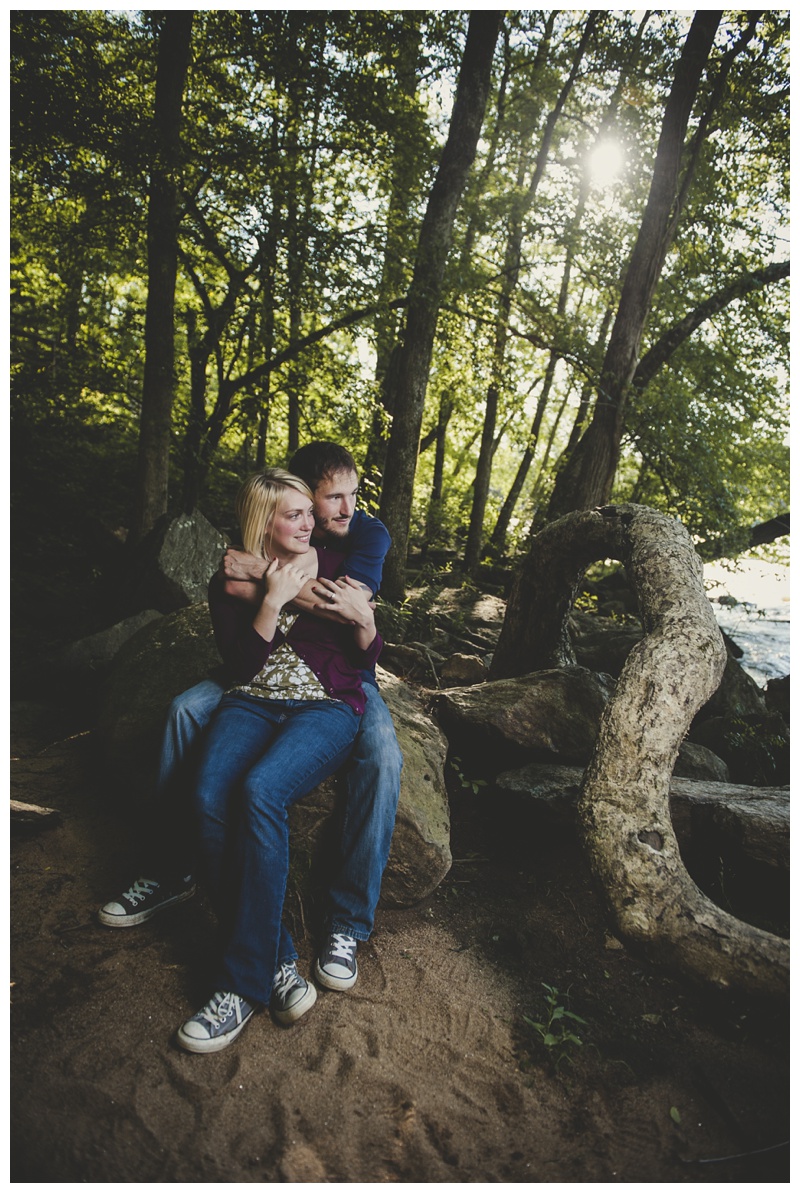
Fig. 6 (Below) – Using flash to oppose the natural direction of sunlight (as seen in the first image) appears acceptable only because there were no stark shadows visible in the background.
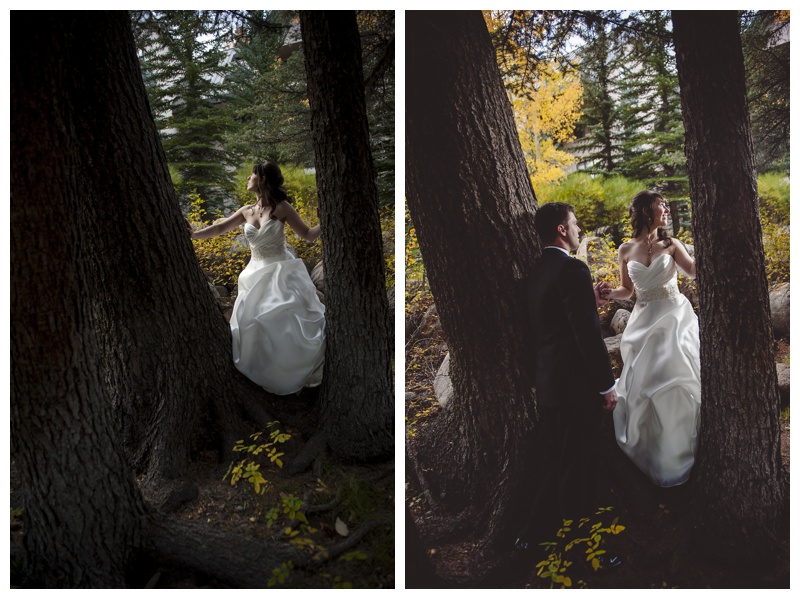
Fig. 7 (Below) – Underexposing the sun, which is rim-lighting the couple, helped retain details in the wedding dress and veil. To soften the resulting contrast, flash was set up in front at camera left. The “cross-light” pattern creates a shapely, flattering shadow on the bride’s left cheek.
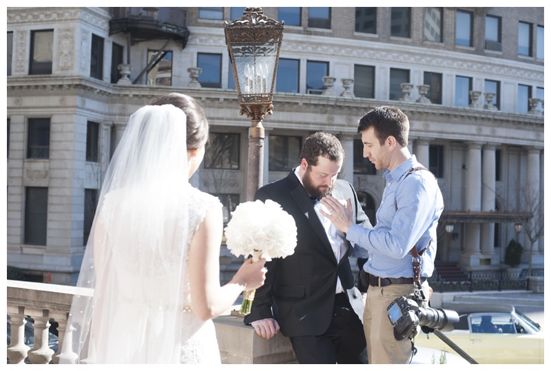
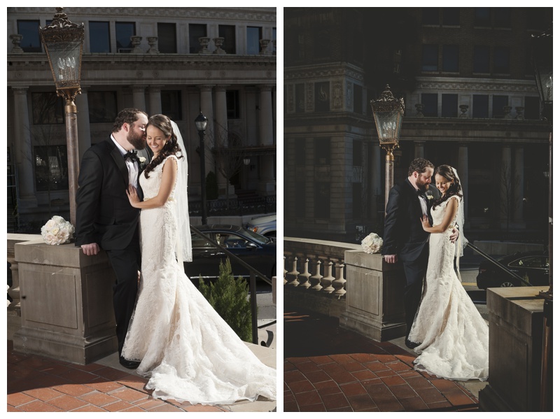
Fig. 8 (Below) – While visible, the ambient exposure is shadowy and unflattering. A flash (placed low from camera right, shot through an umbrella) imitates the direction of the natural light, while smoothing out shadows for a fresh, airy look.
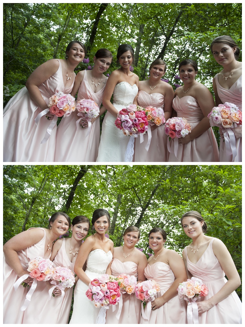
Fig. 9 – First, expose for highlights in the bridal party. Next, add flash at a low manual setting; adjust as needed! From camera right, the flash barely affects the highlight areas (because of the narrow flash-to-ambient ratio) but greatly brightens dark areas in the girls’ faces.
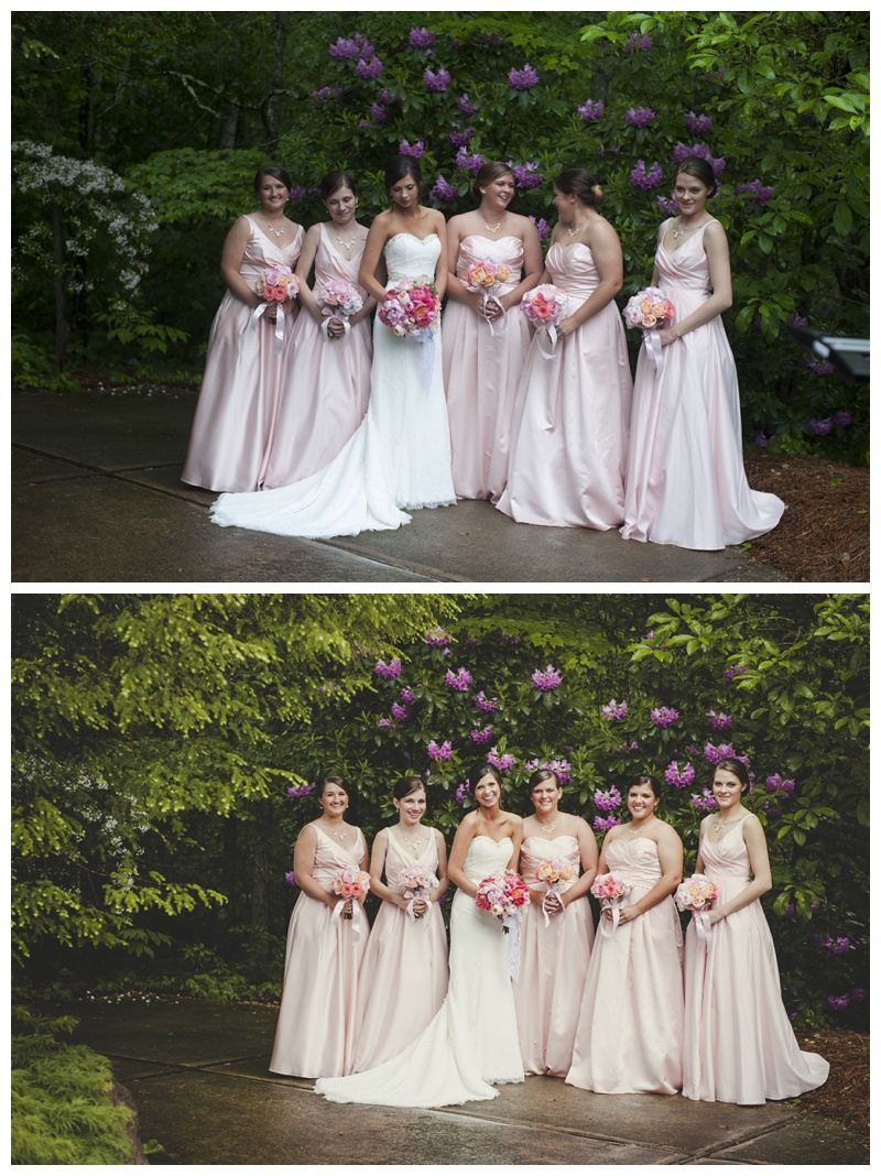
Fig. 10 (Below) – An unattractive space or mixed-light environment can be “hidden” by creating a “black box” – blocking out almost all ambient light via a low camera exposure. A flash placed just three feet in front of the groom lights his face while keeping the rest of the space dark.
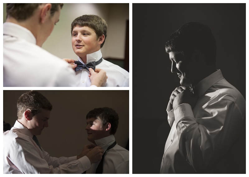
Fig. 11 (Below) – From a styled shoot at ShutterFest, the original exposure is a good picture in itself. However, by exposing for the white silk dress and adding a shoot-through umbrella at camera right, the mood is altered and the silk’s texture becomes more apparent.
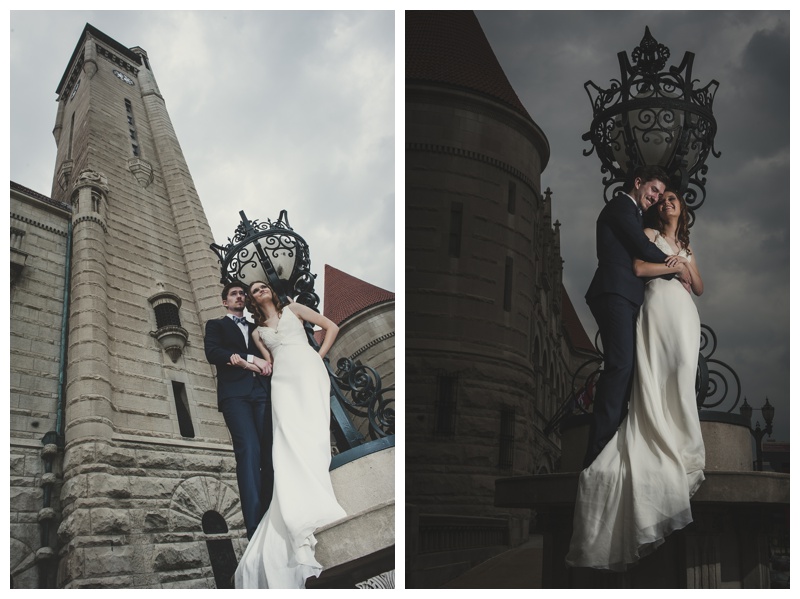
Fig. 12 (Below) – This indoor groomsmen portrait was plagued by mixed daylight (through a skylight), fluorescent light ahead, and incandescent light from the room behind. By dimming the scene and adding brighter flash at camera left, the overall ratio of light became more even. The orange light behind was hidden behind the groomsmen using a lower camera angle.
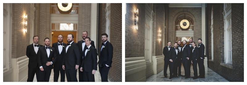
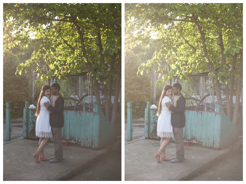
Fig. 13 (Above and Below) – Natural light is beautiful, but it doesn’t always do what you want in the locations you choose. In this case, the image looked okay, but too washed out. By allowing the highlights to remain slightly overexposed (see the over-bright green leaves), the flash at camera left helped create sharp focus and imitated the natural light’s direction.

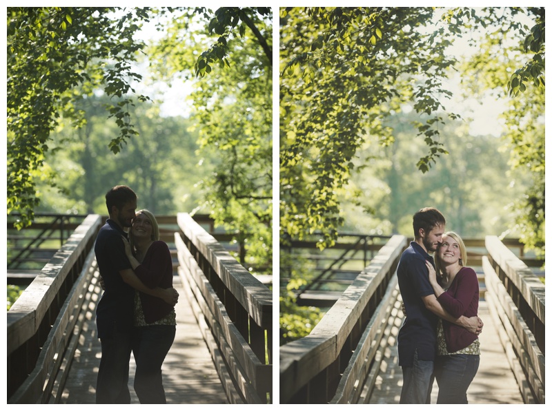
Fig. 14 (Below) – Note that the camera’s exposure setting is chosen in order to preserve the highlights from the sun — as seen in the foliage, on his shoulder and in her hair. In other words, the in-camera exposure is set dark enough so these areas are not “blown out” or lost, yet bright enough that these areas remain slightly overexposed (as you would expect in a natural setting). The fill lights, from a speedlight fired through umbrella at camera right, is set manually at -1 stop below perfect exposure (so as not to overpower the natural highlights). When using spot metering, an alternative flash setting would be TTL -1 stop.

Be the first to comment