
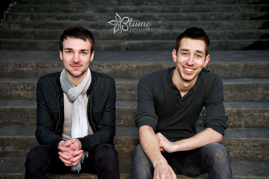
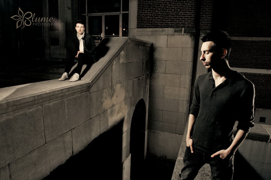
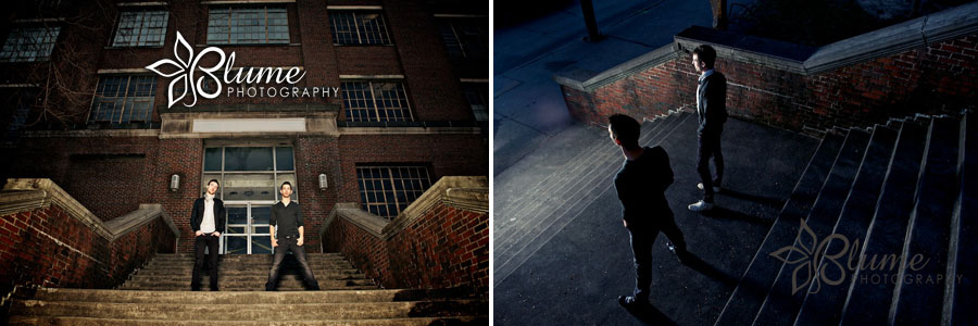
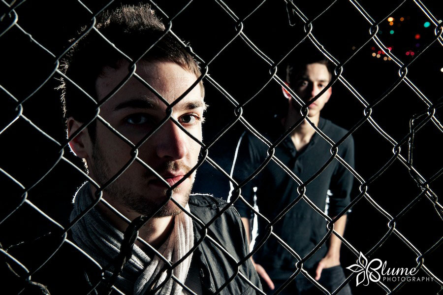
as photographers, eileen and i often find inspiration departing from our usual wedding work, and approaching a project from a different angle. last weekend, our album shoot with atlanta musicians “our modern sonnet” (christian kettlewell and jd cooper) provided us the perfect outlet to mix in something a little edgier and more commercial than is common for us. those of you who are proud to live in the same funky little music town as eileen and i may recall rocking with OMS right here in athens — most recently for a stellar performance at the 2010 battle of the bands. as big fans of OMS, i must admit we were a little star-struck to be composing this artwork for their upcoming album and promotions. christian and jd will be recording their full album in nashville this summer. while waiting for it, be sure to get an earful of ’em on the OMS myspace page. or download them on iTunes! here are a couple of our recent OMS downloads: just like you, angels we have heard on high, and terrified (w/ stephanie lennox). check it out!
now, can we get your help with one last little thing? after listening to the music, we’d like to know which of these images you think should grace the cover of our modern sonnet’s first full album. leave your thoughts in the comments section below. the band would love your input! (..and we’re anxious to see which one is the “winner,” too.) cheers!

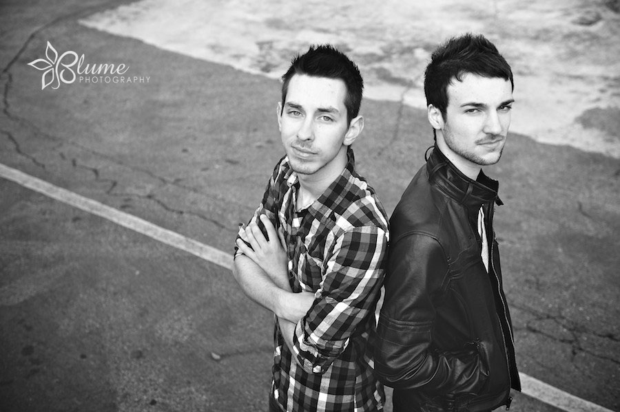

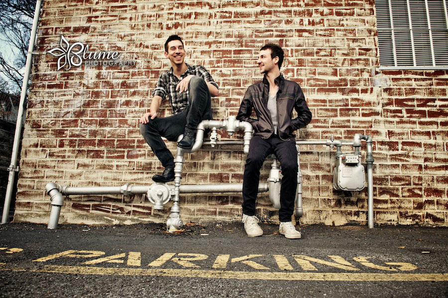
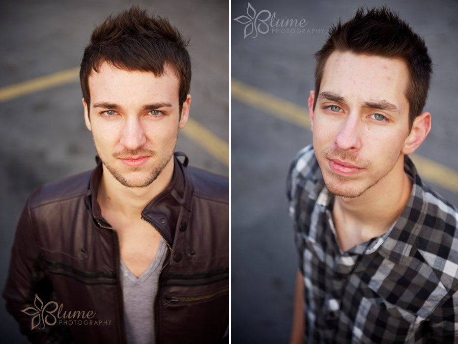
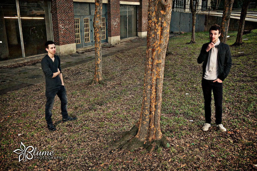
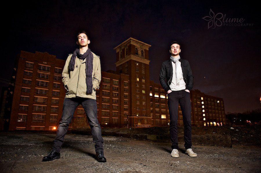
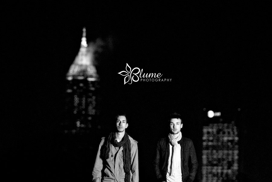
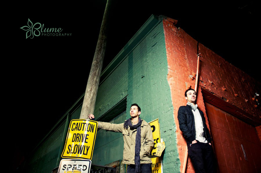
All images © 2010 Blume Photography. It’s unlawful to copy or reproduce our work in any form without our express written permission. (It just ain’t right!) Thanks for respecting us and our art. If in doubt about federal copyright law, please ask us. We’re happy to answer your questions.
I like the second from last 🙂
They’re all so good that I don’t know which one I like best. But, I guess if I really had to choose, I would pick the first picture.
I agree with the above comments. I honestly, think they’re all really cool, but the first and second to last are my favorites
It’s hard to pick but I choose the last picture. It gives both equal billing so that one is not more prominent than the other, it leaves room for a title on the top left without getting in the way of the subjects, it shows jd being quiet and contemplative and christian as more light and playful which gives a feeling of a range of emotions that I’m sure is in their music.
The last 2 are my favorites, i think! 🙂
The first two and the last two look like you caught them in the middle of something, and we wonder what it was each time. Brilliant.
either the 1st one or the one where you guys are sitting on the water pipes or whateever they are….the 2nd to last one is cool, but the buildings detract from the main perspective of the album cover which is ultimately meant to depict the dynamic between the two of you.
These pictures totally rock! =) How very awesomely talented you are and these pictures represent just that!
My favorite two shots: 6 up from the bottom, love the gotham city look, almost b&w but just enough color to pull out the guys. Also love the geometry and stark shadow contrasts. could be a poster for a movie, very edgy and cool. 2 up from bottom is my 2nd choice. Are these guys walking away from a fire they set in the top of the high-rise? great shot.
first or second. all the way. they look like musicians in those.
or one of the ones in the pointed arches, but just cause they’re awesome 🙂